Nowadays, many customers in Asia and the Middle East prefer to include their own photos, believing it increases the likelihood of attracting employers’ attention. However, it is important to note that in countries like Canada, the USA, and the UK, it is illegal to include photos in resumes. In Asia and the Middle East, a well-cropped, high-quality photograph is desirable, especially for job roles such as receptionists, salespeople, and beauticians. If a CV does not contain a photograph, employers may refer to the applicant’s LinkedIn profile, where it is recommended to have a profile picture as per the requirements. Nevertheless, for most jobs, photos are not important, and the focus should be on highlighting skills and experiences that can be easily identified and selected by Applicant Tracking System software based on relevant keywords. The beauty of the photograph is less important compared to the skills required for the job, considering the principles of human ethics, which prioritize qualifications over factors like color of skin, country of origin, religion, culture, age, or physical disability. Therefore, when creating a CV, it is crucial to give more importance to education, skills, and experience by incorporating relevant keywords in an aesthetically pleasing manner.

How are you able to put all the data in aesthetic sense?
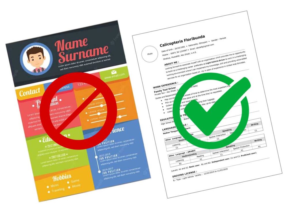
It is advisable to use a sans-serif font in order to ensure easy readability of the details on a monitor by the employer. The margin, headline, subheads, paragraph spacing, and bullet points should be balanced appropriately to enhance the text’s readability and aesthetics. Some job seekers have a habit of using multiple color shades, believing that it will make their CV more unique, attractive, and colorful, thereby increasing their chances with employers. However, this is a misconception. Many computer templates available for CVs are quite similar in style. Conversely, if you observe CVs from European countries, you will find that their templates are often very simple, with all texts presented against a white background and minimal use of colors and fonts. I once encountered a highly qualified candidate who missed an opportunity for a job solely due to poor presentation and low print quality during the interview. Therefore, it is essential to be mindful of the rules and regulations of the country where you are applying for a job and to use a simple template that effectively showcases your skills and experiences, rather than emphasizing personal details such as home address, spouse’s name, passport details, and the like.